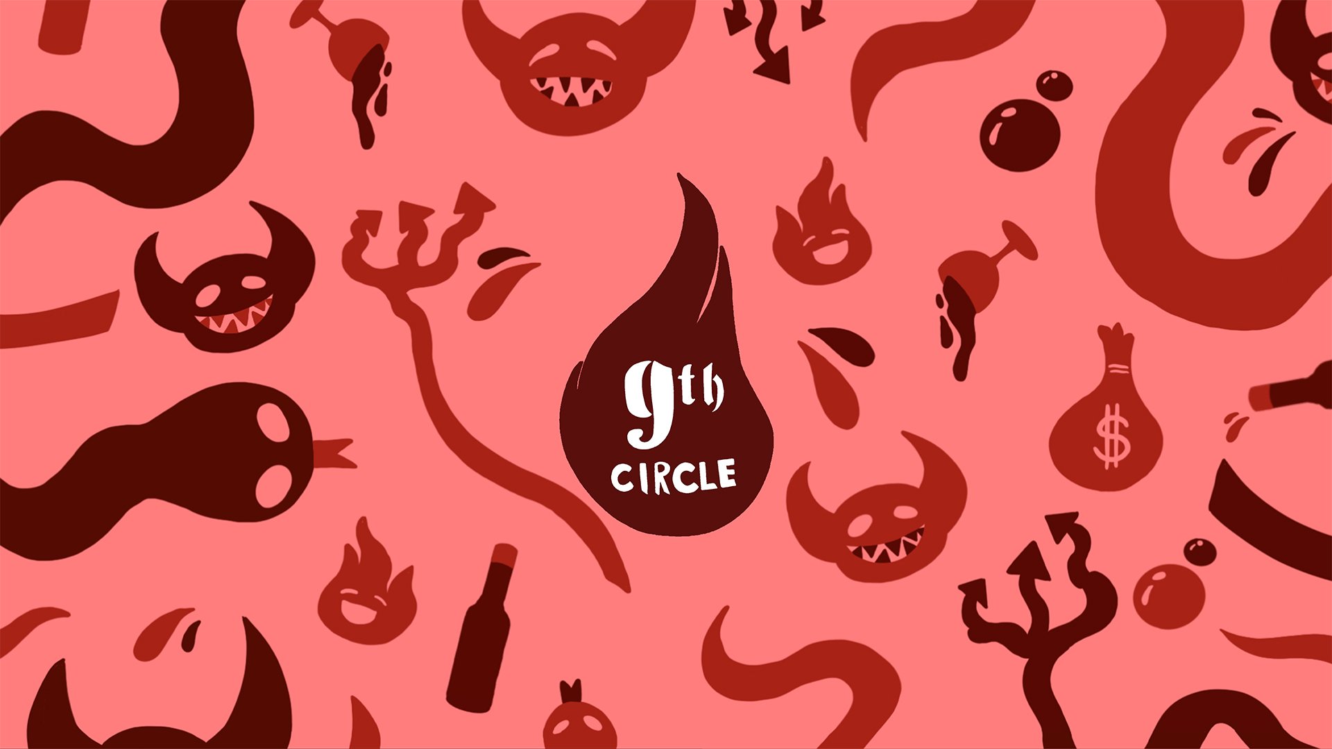
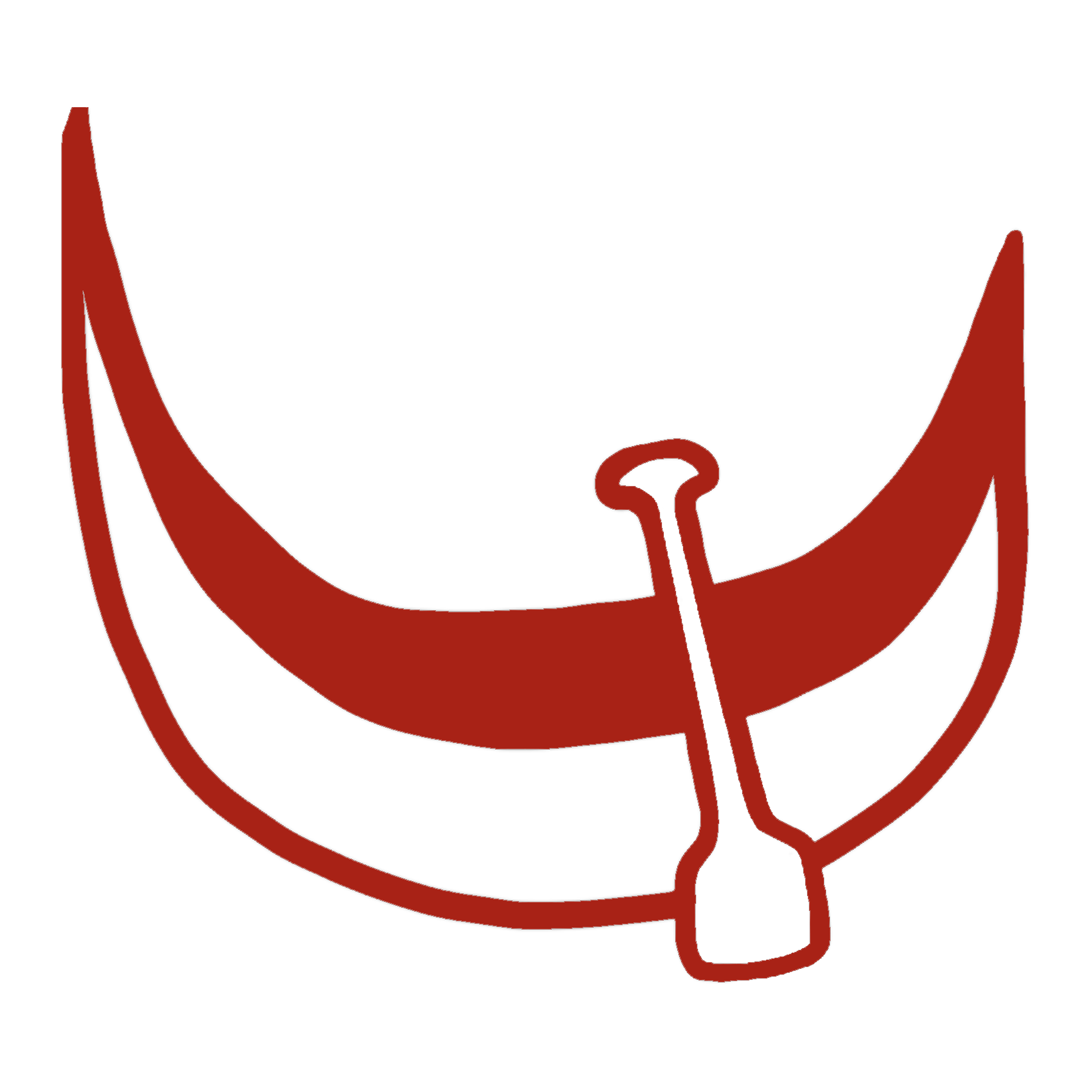
9th Circle
wine company
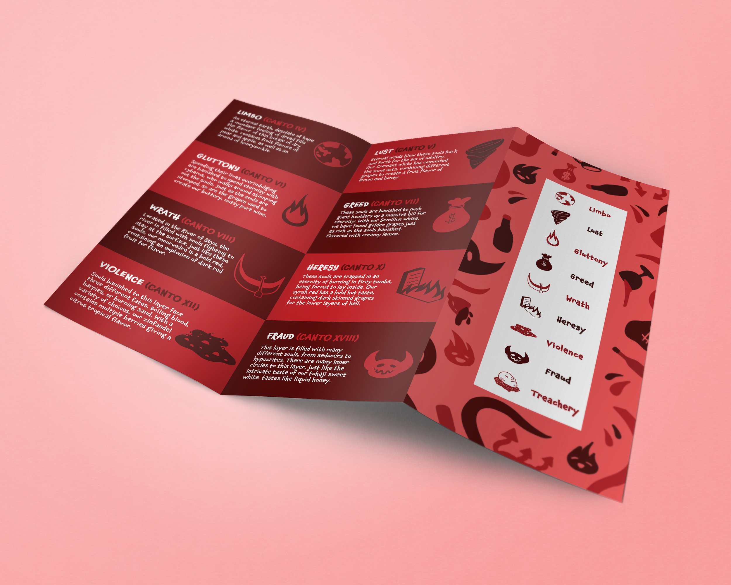
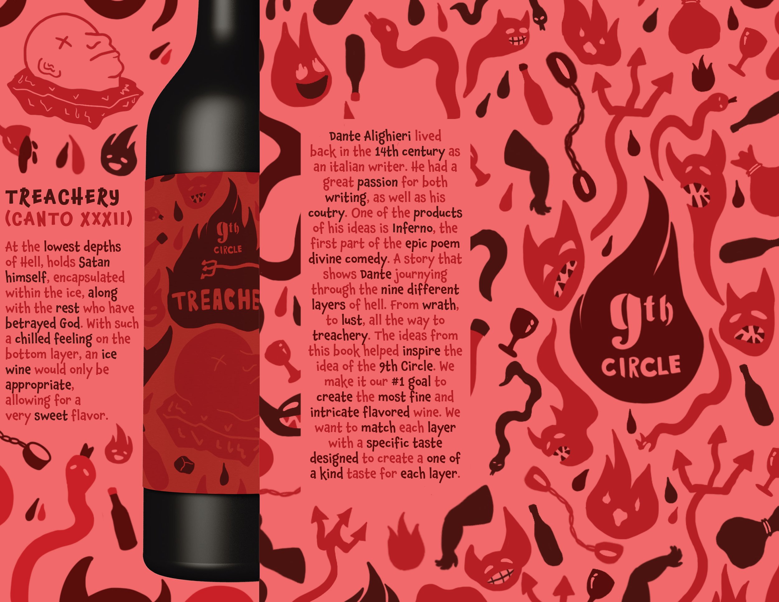
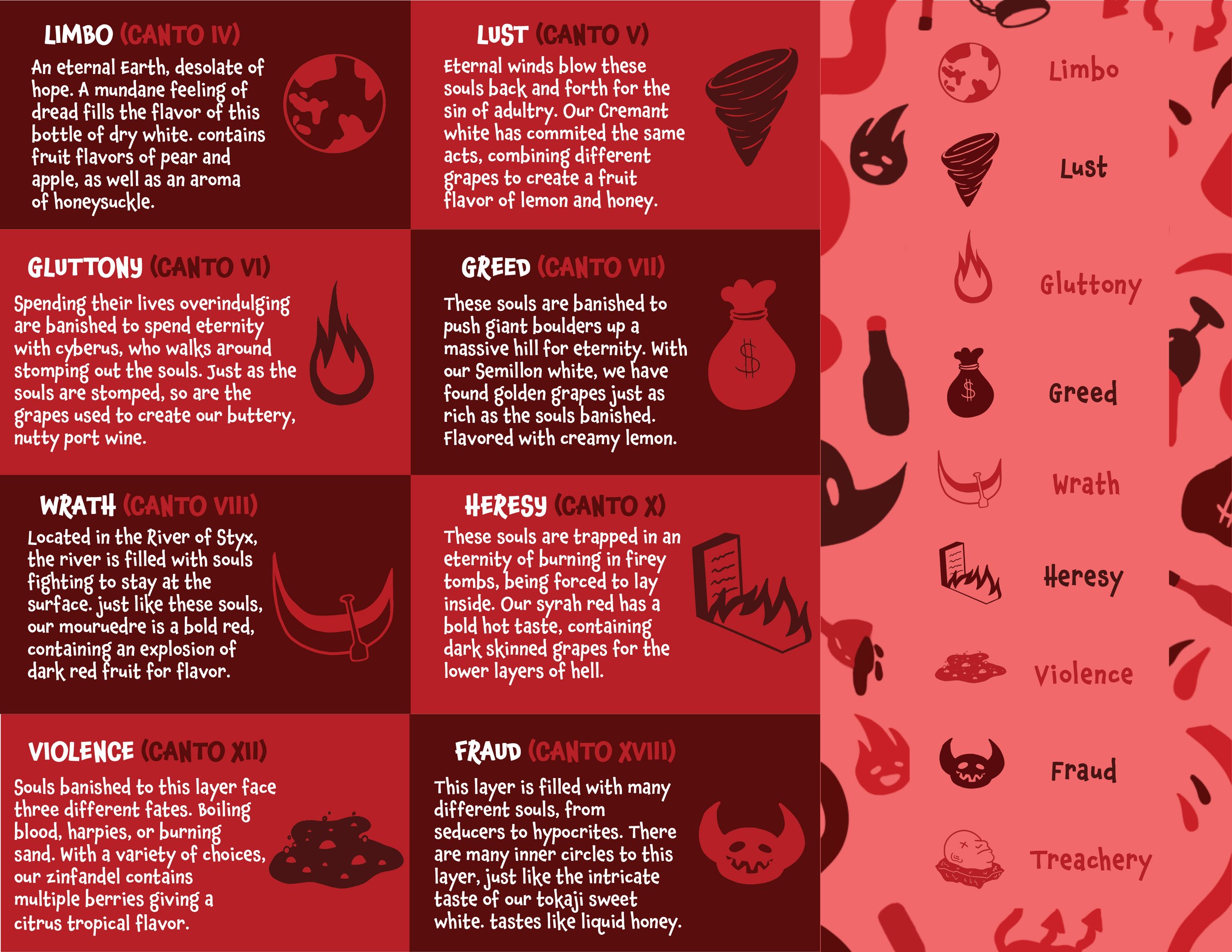
From the coldest depths of the Devil’s bottom layer, to the flaming crypts of heresy, all the way up to limbo at the top of Hell, we have plenty of wine flavors to satisfy your inner thirst. With each flavor matching the sins of the fallen, there are many different layers to try. All inspired by the poem Inferno, written by Dante Alighieri.
Art instructor: Keith Somers
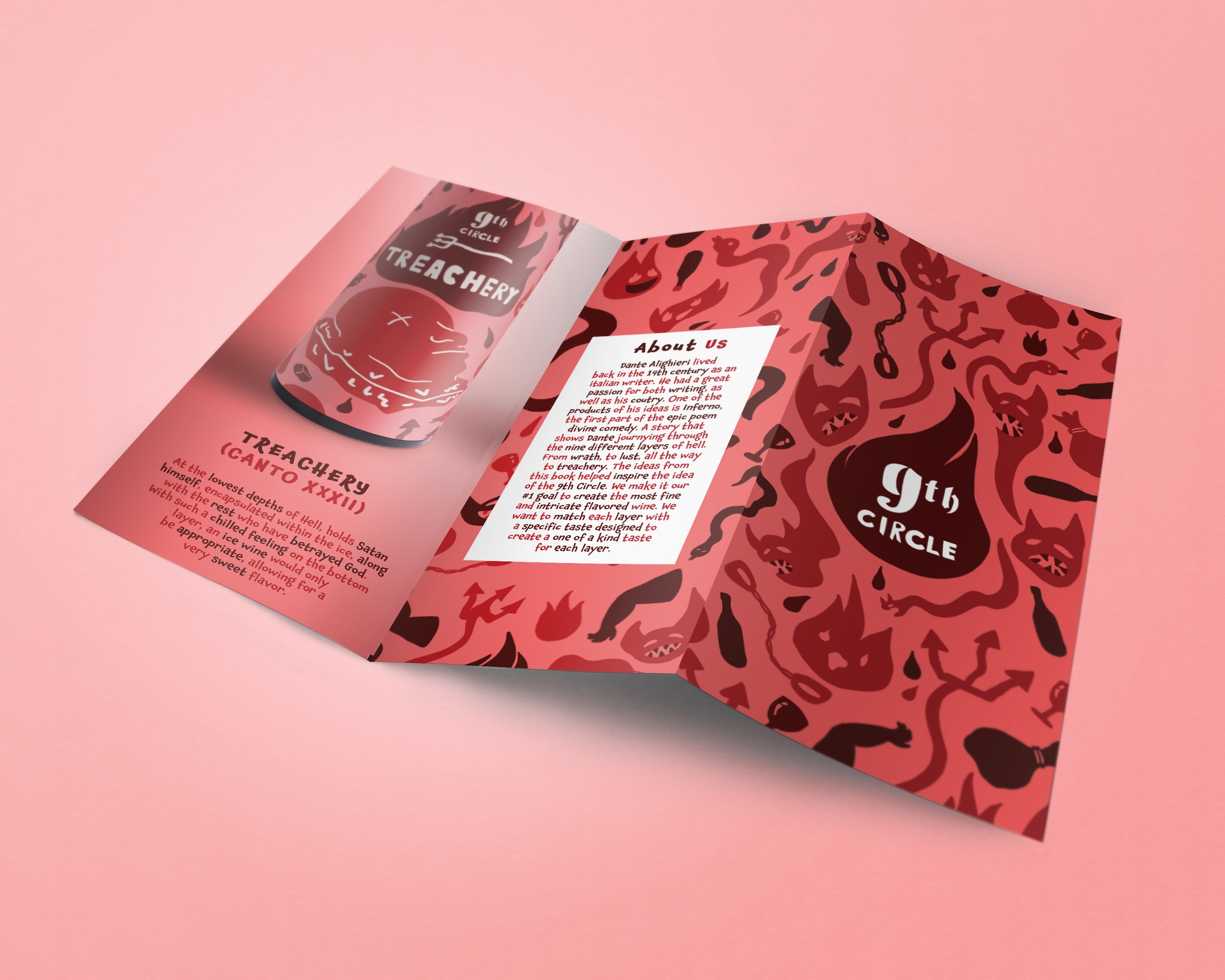
At the beginning of the project, one of the main goals was to create a tri-fold brochure to creatively advertise our company. Another goal was to have multiple deliverables to pair with the brochure, to show depth within the company. The project aimed towards experimenting in the different forms of marketing and advertising that our creative skill would be used for in a business start-up.
Looking more into the start of the project, The main focus was put towards the initial sketches for the logo I was able to brainstorm using paper and pencil,
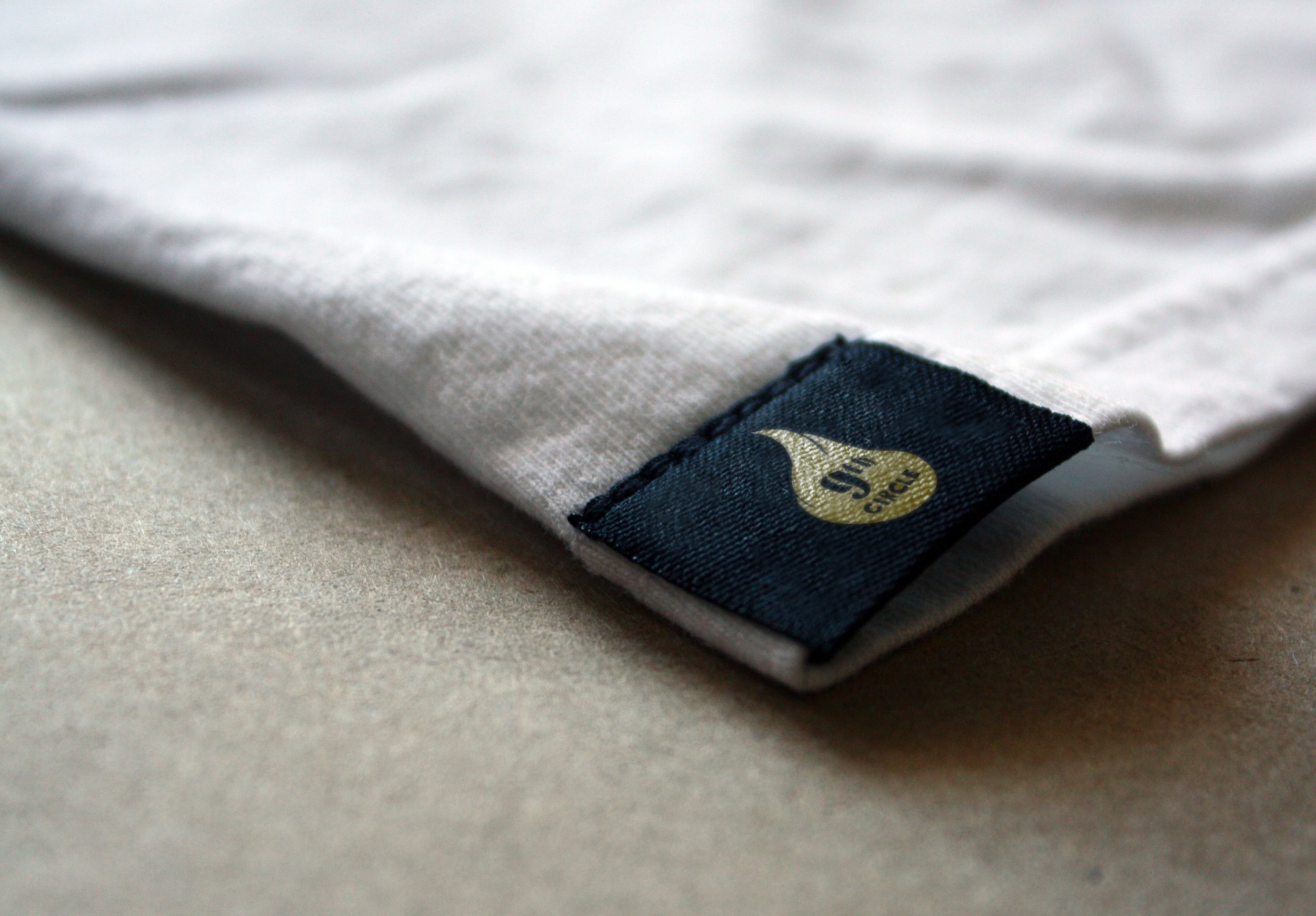
which was then taken and transferred into Procreate. Other areas of the brand I decided to start with was the label design for the bottles of the company, as well as the research done for both the wine flavors, as well as the pairings of the wines with the different layers based on the environment and punishment of each layer.
I was successful in including way more of my illustrations into the project as a whole. Giving each different bottle a hand designed different label felt like a great way of showing off what I can achieve as an illustrator while still being able to show off many different areas of design as well.
Some things that didn’t end up working as well as the creation of the website for the company, it is very basic, since it was one of the last parts of the project I focused on, and in the end should have dedicated more time to polishing the website to give more to show through the project. This is definitely an area that I did struggle with at times, since it has never been my preferred area of design.


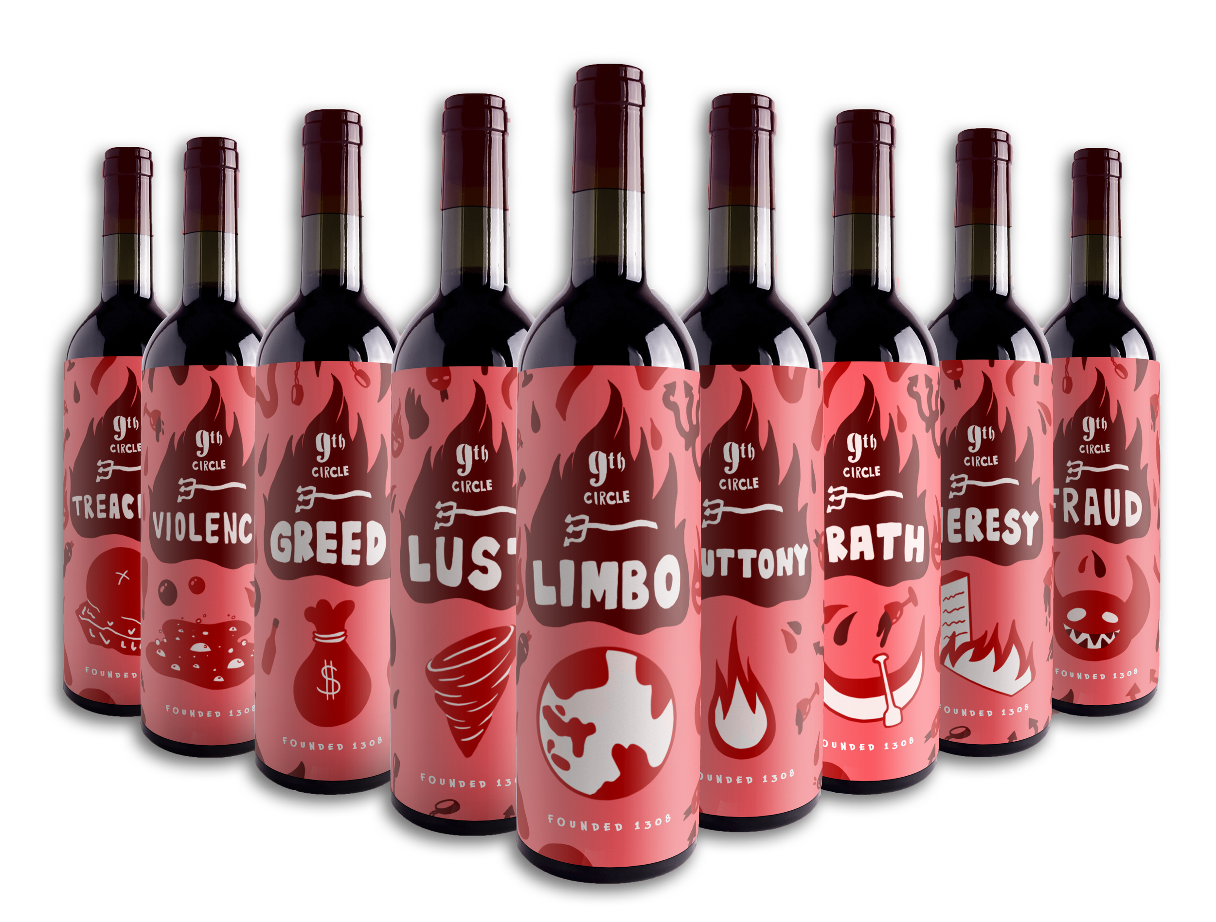
I was able to learn a lot through this project. One of the first things I learned is how important research is before anything else. Before I started creating any of the bottles, as well as most of the logo designs were not touched until after I finished research with what I felt like I needed to know to start working on the project. It allowed for my creativity when designing to be more clear with the direction I want to focus with the information I had researched.
This project also gave me a lot of time working in photoshop, illustrator, as well as procreate. Being more new to procreate when I started this project, it helped for a lot of good practice in learning the whole program, as well as broadening my knowledge as to what I can achieve in the program. As for Illustrator and Photoshop, the multiple hours of work for this project done on those programs has benefited me as well.